Rose Bennett Interiors
“While traditional design principles are critical to understand and honor, I love to mix them with mid-century modern, industrial, and vintage eclectic.”
The
Designer:
Rose
Bennet
It was a few words of encouragement from a teacher that set Rose Bennett on her journey towards a career in interior design. Growing up in Philadelphia with a hard-working single mom, Bennett and her sister discovered joy in art, which became an important part of her life. That’s where she credits a teacher for recognizing something in her. “I was a freshman in high school, and I had an art teacher say to me, ‘you can really draw’ — and just one person saying that to me changed me.” From that point on, Bennett became intensely immersed in art — focusing on drawing self-portraits, painting, and charcoal work.


After about five years of dedication to her artwork however, Bennett found herself burnt out with the process and needed to take a step away. It was after getting her first house that she realized how much she enjoyed working on interiors and decided it was time to go back to school. “I wanted to do something creative, but I didn’t want to be an artist.”
She completed her B.S. in Interior Design from the Art Institute of California, before returning to the East Coast with her husband and newborn son. She also brought home an expanded view of the design world. “Philly is very traditional in general, so growing up that’s what I knew — traditional design.” Now back in Philadelphia, Bennett has her own firm, Rose Bennett Interiors, where she focuses on residential interior design and works as a real estate agent.
The Vision
Bennett doesn’t pull inspiration from one central place or design‚ but has an aesthetic she describes as “part Malibu Bohemian, part Gramercy Park Hotel”. While traditional design principles are critical to understand and honor, says Bennett, she loves to mix them with Mid-Century Modern, Industrial, and Vintage Eclectic.
“Some design aesthetics that I love are Soho House for its mix of vintage and modern/industrial. I adore Leanne Ford and her clean modern approach to design, and Aude Malbat Christin for her incredible layering of
rich hues and textures. My absolute hero Iris Apfel for her eclectic rule breaking style. A recent obsession is Tyler Hays,” she adds. “I was in his showroom in New York and didn’t want to leave.”
Bennett likes to incorporate contrast, symmetry, pattern, and repetition to create unity in a space. “My design philosophy is that a space should transcend you, whether it is your home or your workspace. My biggest goal is to make people truly happy being in the space.”

The Process
A big part of Bennett’s design process is listening to her clients while also giving them permission to test their limits. “Sometimes I have a client that is traditional, and they are afraid of modern, or they don’t know how to deviate from what they know,” says Bennett. “I really push them into understanding that bringing some of those elements in is going to elevate their space or give it a twist.”
She then starts working with CAD (Computer-Aided Design) for space planning and circulation. “I like to start by asking what are the functions of the space architecturally? What are we putting in the space? Are we doing build-ins?” she says. “Design always begins with function and what the client needs in the space, and once that is established everything else becomes a layer of the overall vision.”
The Project
Bennett recently expanded her portfolio to include commercial interior design when she was brought in to design the interiors for the Red Tettemer O’Connell + Partners (RTO+P) advertising agency, which boasts clients such as Sparkling Ice, Nesquik, and EJ Gallo Winery. The agency, where her sister Carla works as a Managing Director, and her

brother-in-law Steve serves as President and Co-Chief Creative Officer, sought to relocate to establish a state-of-the-art production studio. The increased demand for in-house content production prompted this move, and due to the pandemic and remote work requirements, it was more logical to create a more flexible workspace, including areas for virtual meetings and convertible offi ces that could easily adapt to changing workflows.
After months of looking and negotiating a coveted ground-level space in Philadelphia’s Aramark Building, they made the move.
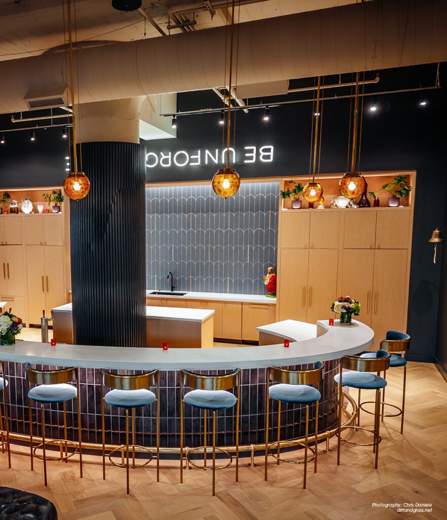
“When they say there are no rules – they mean no rules.”

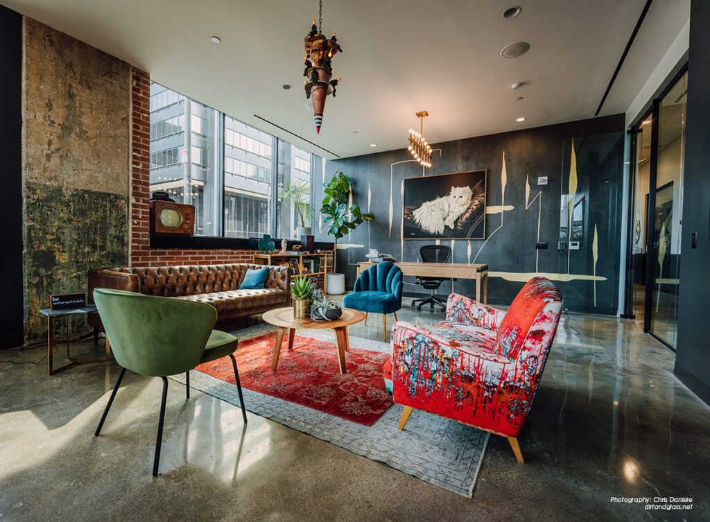
“The best part about designing for an ad agency that is known to stretch the boundaries and rules in their own profession is when they say there are no rules — they mean no rules,” says Bennett. RTO+P was looking for a creative, updated modern space that promoted open collaboration with options for a private office, open workspaces, soundproof call booths (zoom rooms), editing room, a production studio area to build sets for commercials, unconventional conference rooms, and a fully stocked bar that serves as a central social point for team members after hours. Since the two co-CCO’s liked sharing an office in their old space, they chose to continue working together with a shared common space in the middle.
“The overall goal was a creative space that looks elevated but doesn’t take itself too seriously,”
says Bennett, with many of the lighting and art pieces throughout the office collected by one of the owners over the years. One of many playful elements in the space is a row of offices that each have a letter on the back wall that spells out “Let’s Ride” — a mantra for the company. “We just got super lucky that when I counted the offices, we actually could spell it out”. In addition to reusing a lot of the furniture, artwork, and accessories from the old office, the team also shopped at vintage stores and reupholstered a classic mid-century sectional by Chairloom, a local Philly business.
Having the architect’s office located in the same building was a huge advantage. “I would say our biggest challenge on the project was working through Covid,” says Bennett. “Delays of materials, etc., were an issue, but thankfully Tantillo Architecture has great relationships, so we were able to get materials or alternative materials from their trusted vendors when needed”.
Bennett applied a palette of different textures, colors, and materials to match the edgy personality of the agency. “For me, tile really sets the mood of the space,” she says. “Garden State Tile has been my trusted design partner on this project. I’ve had the pleasure of working with Amanda Klein (Design Consultant) and Valerie Hutchinson (Showroom Sales Director), who have been incredibly knowledgeable and are great to work with.”
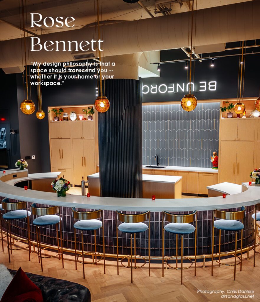
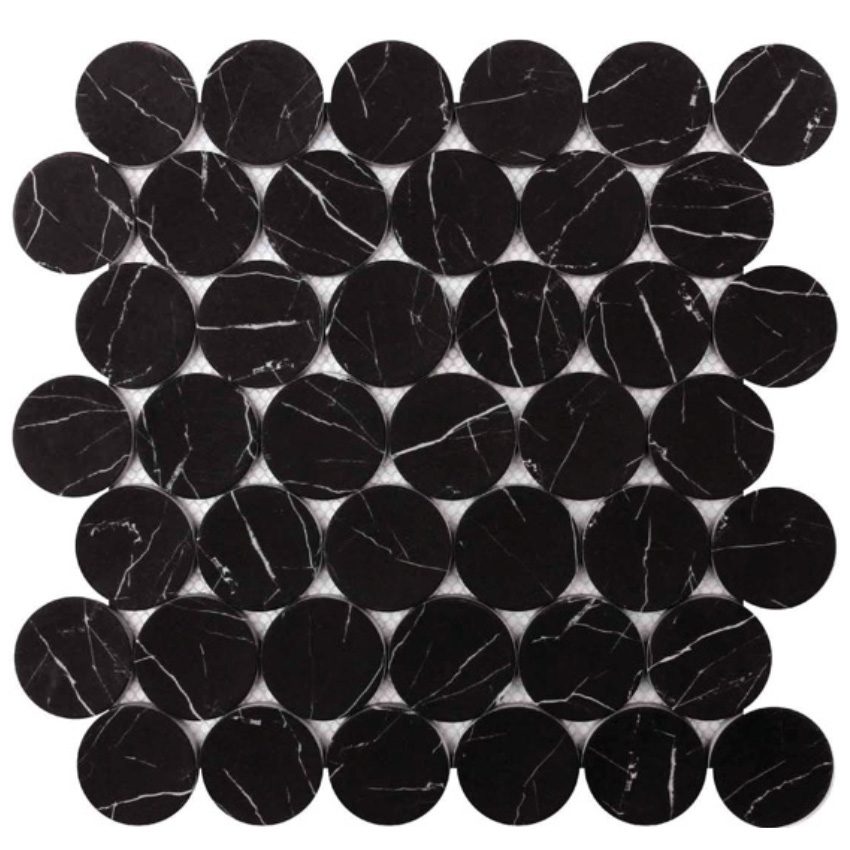
On the floor of the office vestibule are oversized black penny tiles with white veining that are “just the right mix of vintage and modern,” says Bennett. The next area that required tile was the office’s open bar — the social center of the agency where parties and gatherings take place. “When I saw the large blue scallop tiles with brass accents, I knew it was perfect for the bar wall,” she says. “It’s a little art deco, a little modern, and it repeated the custom metal archways into the common area and the two custom arched 10’ x 6’ pivot glass doors by Cottingham out of New Jersey.”
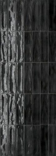
Black, watery, high gloss subway tile was applied to the front of the massive, curved bar as well as to the front of the office’s large planter. Behind the bar is another one of the agency’s mantras — “Be Unforgettable” — but with a twist. Made by a local neon sign company, the words are flipped upside down to make it clear this agency thinks outside of the box.
Bennett sees value in clients becoming more open to expressing themselves during the design process. “We have very savvy clients these days that are educated and many have strong ideas and opinions, and they need someone to help pull them into a cohesive direction,” she says. “In the end, it’s our job as designers to help our clients through these stresses and make sure they are happy.”

The Sources & Materials
Garden State Tile
Tile for entryway floor, bar front and back wall, and planter front:
gstile.com
Client:
Red Tettemer O’Connell + Partners
rtop.com
Interior Design:
Rose Bennett Interiors
rosebennettinteriors.com
Architect:
Chris Tantillo
tantilloarchitecture.com
Contractor:
The Sullivan Group, Joe Winchester
thesullivancompany.com
Wallpaper:
Custom Wallpaper by Kate Raines, Moth Paper
mothpaper.com
Neon Sign:
Urban Sign Group
urbansigngroup.com
Custom Painters for “Let’s Ride”:
Keystone Sign & Company
www.keystonesignco.com
Upholstery:
Chairloom
chairloom.com
Entryway Floor
NERO MARQUINA DOTS
ROCKART MOSAICS
Proving small things can make a big impact, these recycled glass mosaics are used in the 15-square-foot entryway of the RTOP office. The ¼’’-thick tiles are a modern, stylish take on the typical penny round due to the larger scale of the dot, a matte black finish with white veining, and an uneven surface that divots in the center. To up the cool factor, Bennett selected a black grout.
Front of The Bar & Planter
FORMA OSSIDIANA
These 3’’ x 12’’ black glossy porcelain rectangular tiles were installed vertically along the front of the RTOP’s curved bar and the curved planter opposite it. Ossidiana is part of the Forma wall and tile collection from GST that features an array of full-body porcelain stoneware tile, white-body, glazed ceramic wall tile, and glazed stoneware wall tiles inspired by cements and resins.
Bar Back Wall
FORMA OCEANO TESS. VOLTA ORO
Another part of GST’s Forma Collection, these matte blue, scalloped shaped ceramic wall tiles come in 15’’ x 12.5’’ sizes measuring 8.5 millimeters thick. Suitable for dry or wet interior spaces — such as the back wall of the central bar in RTOP’s office — the tiles feature an offset brass accent.

 Go Back
